
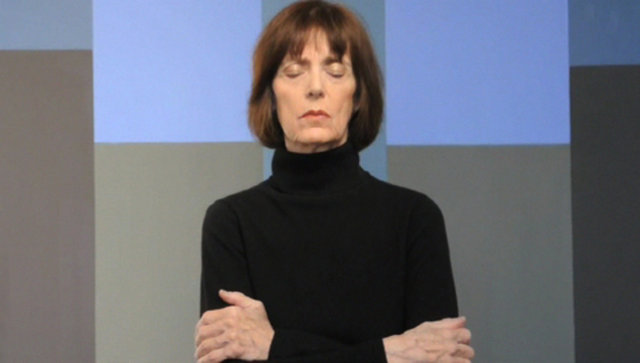
It’s Day 144 and I’m excited because I drove the car around tonight when Matt came home. We went out to Target and then went to dinner. I’m less nervous in the car. I haven’t driven in over ten years so that’s normal. It’s starting to feel more natural again though. Yes, I’m 35…don’t judge! Anyway, join me in honoring Pat Lipsky today! This piece was fun to paint. 🙂
Pat Lipsky is an American painter associated with Lyrical Abstraction, Color Field Painting, and Geometric abstraction.
Lipsky grew up in New York City. She graduated with a BFA from Cornell University in 1963, receiving
an MFA from the Graduate Program in Painting at Manhattan’s Hunter College, where she studied with the painter and sculptor Tony Smith.
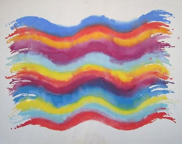
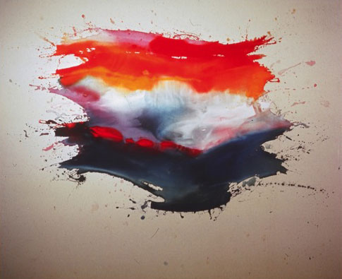
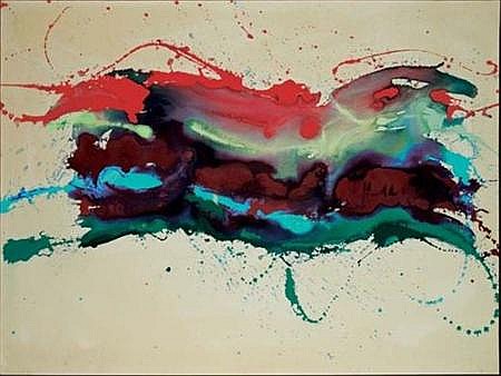
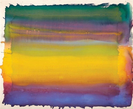
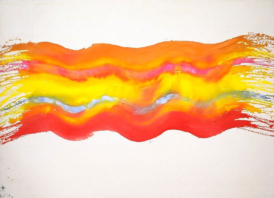
Raised by a painter mother and an engineer father, Lipsky had her first one-woman show in New York, at the André Emmerich Gallery. Her work at the time was strongly in the mode of “Lyrical Abstraction.” The 1969 canvas “Spiked Red” (Collection of the Modern Art Museum of Fort Worth, Gift of Mr. and Mrs. Peter Bienstock, New York) demonstrates Lipsky’s then-approach: close hues, bright color waves and bursts. In The New York Times, the critic Hilton Kramer found that the painter’s work looked both to the aesthetic past and future: “Miss Lipsky reintroduces the drip, splatter and smear of abstract expressionism for notable anti-expressionist purposes…She also demonstrates a very clear identity of her own. Her pictures are very handsome, and it will be interesting to see how she develops what is already a bold pictorial intelligence.”
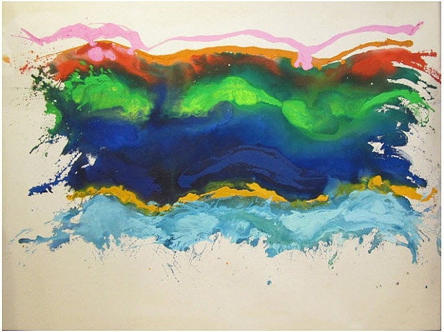
Lipsky was invited to participate in the influential 1970-1971 Lyrical Abstraction exhibition which traveled the country and culminated at New York’s Whitney Museum; the critic Noel Frackman highlighted her contributions for freshness, gesture and exuberance, finding the style “sustained a mood which celebrates the sheer splendor of color. The edges of these shapes lick out like flames and there is an incendiary vividness in the impetuous yet directed forms…These are mouth-watering paintings.”
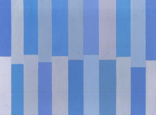
By the later seventies and eighties, Lipsky had expanded her palette to include bolder
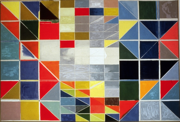
colors and geometric forms. She had also begun to explore, as the critic Katherine Crum later wrote, a pictorial vocabulary in direct challenge to her roots in lyrical abstraction. By 2003, the critic Karen Wilkin would declare Lipsky in The New Criterion to be an “unrepentant abstract painter.” Wilkin found in the work, “A lifetime’s accumulated experience of all kinds, including the experience of looking at art. That, of course, is what all art worth taking seriously—whether abstract, figurative, or somewhere in between—is supposed to address.”
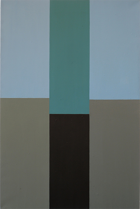
In the 1980s and 1990s Lipsky continued to refine her broader color concerns, achieving a brooding, more sharply-defined palette. A selection of works from this period, “The Black Paintings,” was exhibited in Miami in 1994 and New York City in 1997. Wilkin found the “deliberately limited” dark work of this period to be “dramatic” and “powerful.”
The critic Elisa Turner again described them as a step away from the “sleekness” of
modern abstract painting, toward the direction of vertigo, emotion, and ambiguity: “This vertigo adds an unnerving, emotionally-charged twist to the tradition of sleek, impersonal abstract art…Such ambiguity about the location of lines and shapes in space is echoed in her exquisite sense of color.” The New Yorker magazine instead drew a connection of her work in this period to the “classic” style of calmly modernistpainters Piet Mondrian and Paul Klee.
In the 2000s, Lipsky began another redefinition of palette, reincorporating color within a bold central image. Writing in the New York Times, the critic Ken Johnson associated these pictures with mechanical forms and music. Noting their “seductive, egg-shell surfaces,” Johnson linked them to the minimalist painters Frank Stella and Ad Reinhardt. “The effect is polyrhythmic in three dimensions; the bands seem to push up and down like valves in a machine[,] enhancing the feeling of Bach-like musicality. The more you gaze at them, the more absorbing they become.”
Lipsky began to focus on single images presented in series. Her more recent
exhibitions have contained repeating colors, in a stripped and repeated form. The painter and critic Stephen Westfall, in Art in America, called these paintings “her most successful,” finding her “classicism” to be “ultimately idiosyncratic in the best sense,” and finding a link to Ad Reinhart and Philip Guston: “Guston meeting Reinhardt, then; a synthesis that, however full of painting culture, feels just right in our present moment.” The critic David Cohen, in The New York Sun, noted instead the opposite of classicism, “a steely, seemingly dispassionate composure” that contained “seething reserves of aesthetic emotion,” stating, “Lipsky is not merely the dean of contemporary geometric abstraction but its dominatrix.”
Karen Wilkin, reviewing Lipsky’s 2006 exhibition, discovered in the work a simplicity that served the reverse function—to be ultimately liberating: “Lipsky’s complex, richly allusive counterpoint demands that we pay close attention to her paintings as paintings…and then rewards us by setting free our imaginations.”
Biography is from wikipedia.
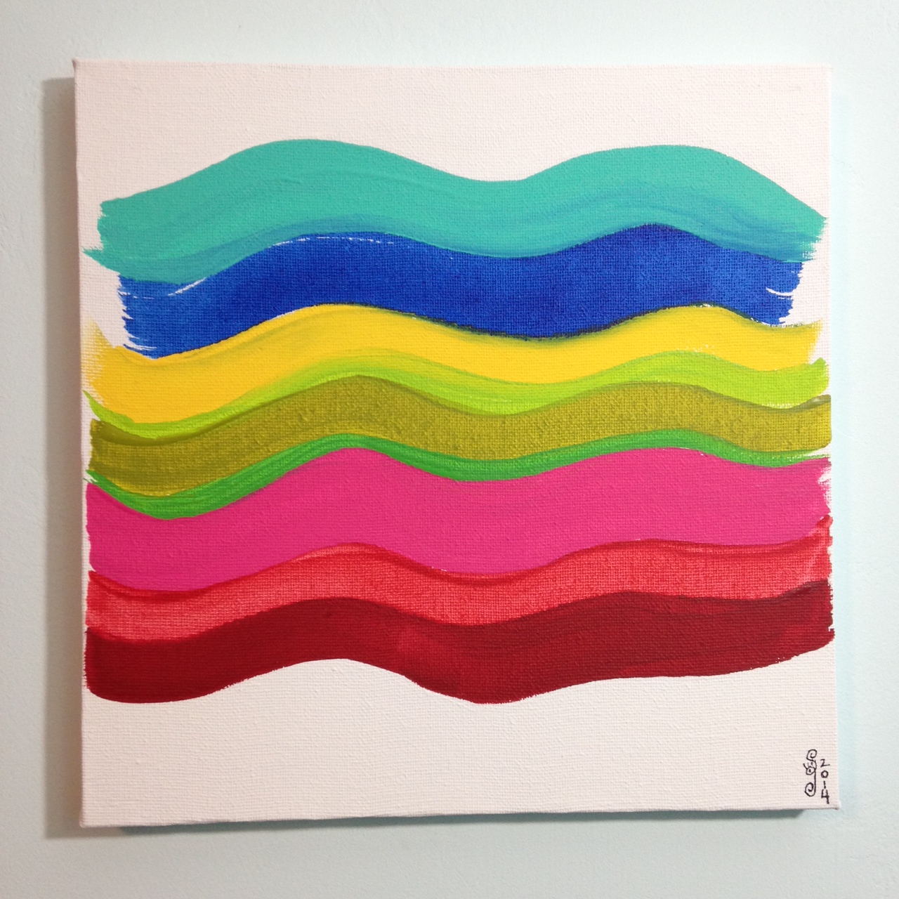
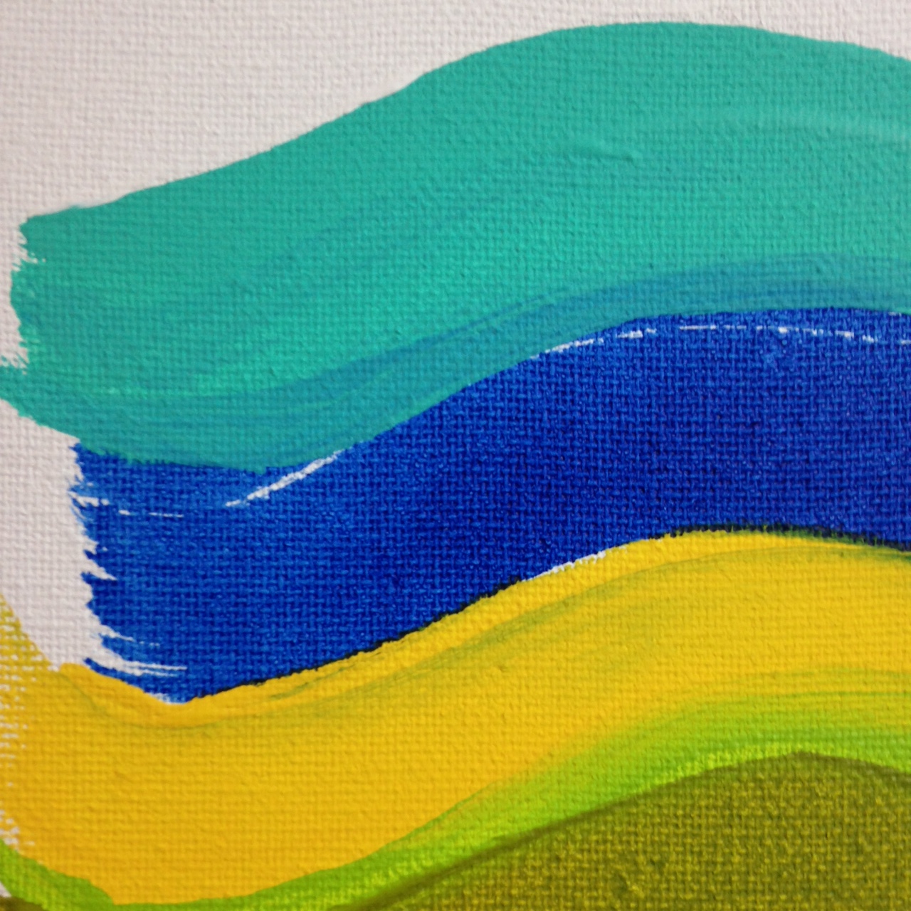
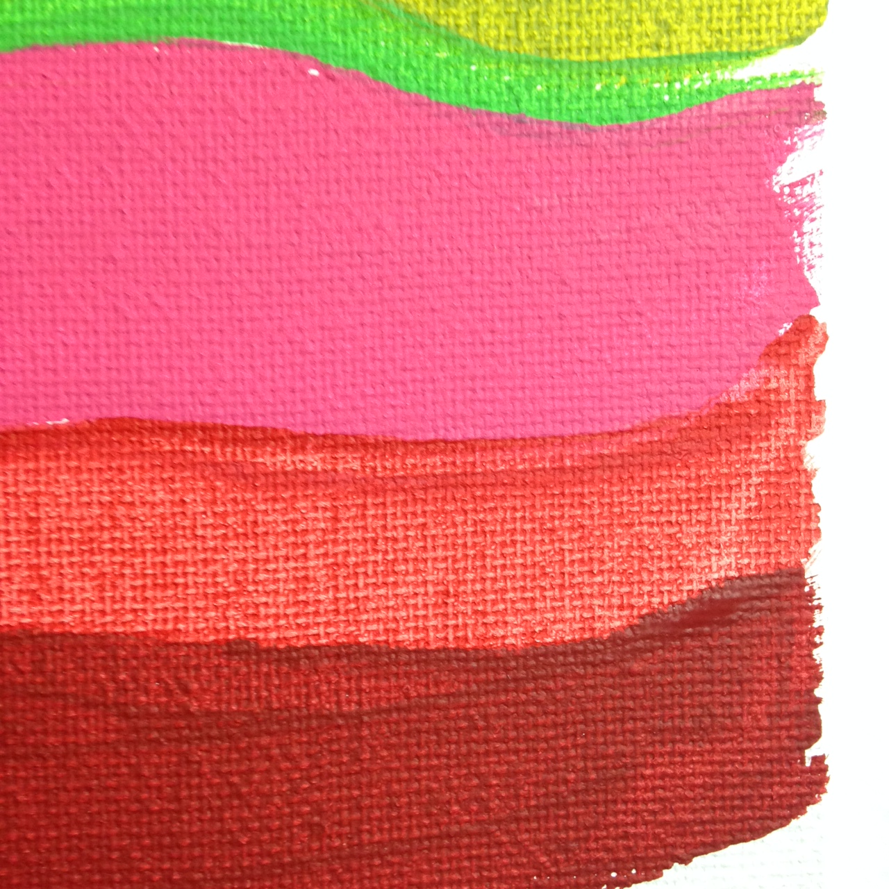
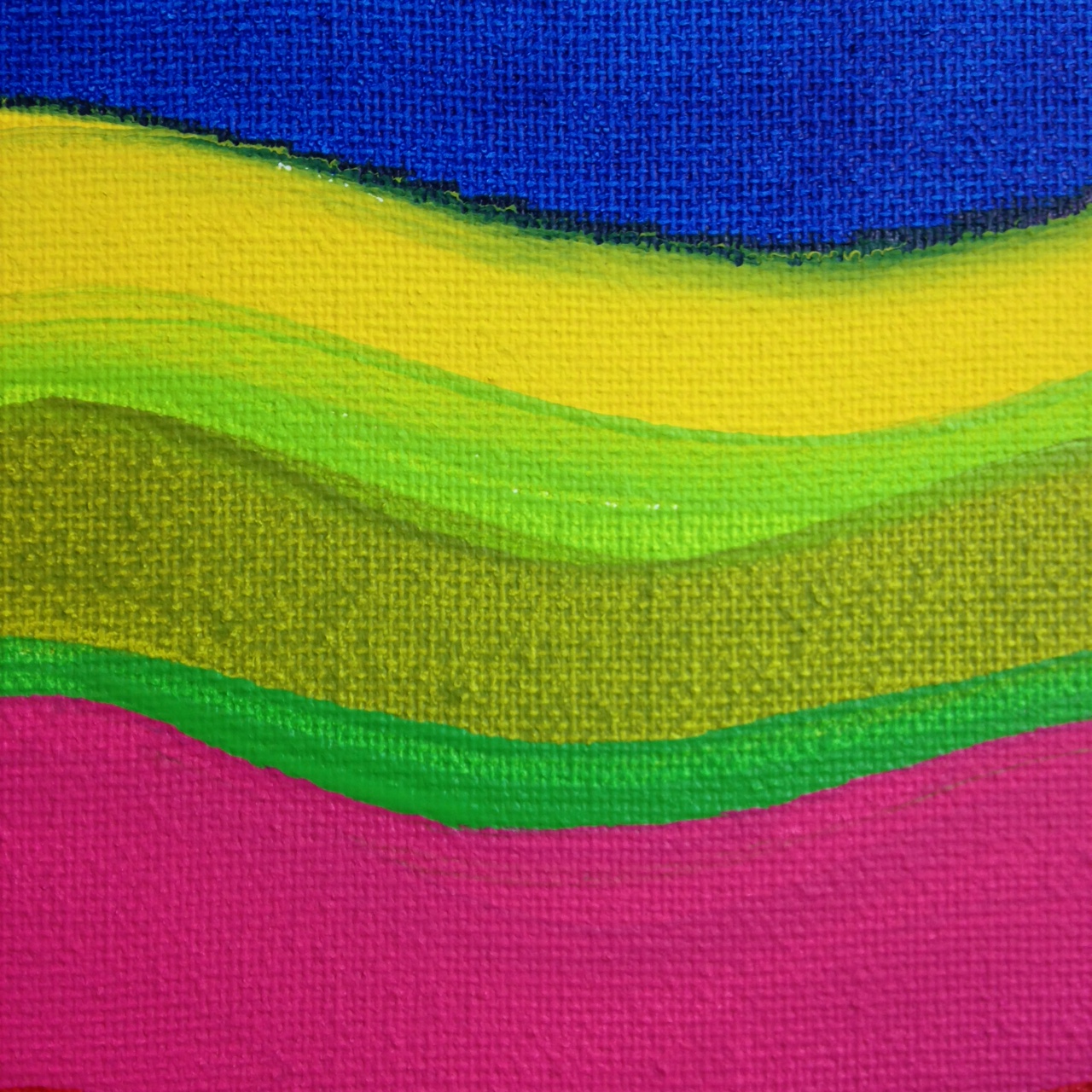
Lipsky’s style has evolved and changed throughout her years of painting, but I wanted to focus on her Lyrical Abstractionist years. The rainbow palette of waves. I was really drawn to those. I wish I had a huge canvas to do a tribute in this style…I’m talking 50 feet long! Now that would be fun. I hope you enjoy my piece and I’ll see you tomorrow on Day 145. Best, Linda
Linda Cleary 2014
Acrylic on Canvas
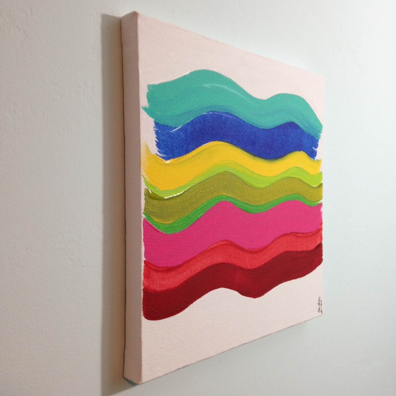
Summer Stache- Tribute to Pat Lipsky
Linda Cleary 2014
Acrylic on Canvas
Summer Stache- Tribute to Pat Lipsky
Linda Cleary 2014
Acrylic on Canvas
Summer Stache- Tribute to Pat Lipsky
Linda Cleary 2014
Acrylic on Canvas
Summer Stache- Tribute to Pat Lipsky
Linda Cleary 2014
Acrylic on Canvas
