It’s day nine and it sure was a challenge for me today. Lots of things going on in my personal life and also spent the day on the set of a movie, Superpowerless. Very exciting, but definitely didn’t have a ton of time to spend on painting. BUT I did it! And the artist I’m presenting today is…
Ray Parker!
I tried my hardest not to do two abstract expressionists in a row and also not two artists that focused on color theory, but I decided to do Ray Parker today anyway. I also apologize again for inserting his wikipedia bio…

but…oh well. Let’s read about this wonderful man and not confuse him with Ray Parker Jr. who wrote the theme to Ghostbusters…because Ray Parker could’ve in fact been afraid of ghosts.
 Raymond Parker was born in 1922 and he died in 1990. He was known as an Abstract expressionist painter who also is associated with Color Field painting and Lyrical Abstraction. Ray Parker was an influential art teacher and an importantColor Field painter and an instrumental figure in the movement coined by Clement Greenberg called Post-Painterly Abstraction.


Originally from South Dakota, Ray Parker entered the University of Iowa in Iowa City in 1940; he earned his MFA in 1948. From 1948 to 1951 he taught painting at theUniversity of Minnesota in Minneapolis. During the 1940s his paintings were heavily influenced by cubism. In the early 1950s, however, Parker became associated with the leading abstract expressionists of the day, including Mark Rothko and Willem de Kooning. Parker soon began to simplify and refine his works realizing that through abstraction, and color his paintings could convey and express emotion.
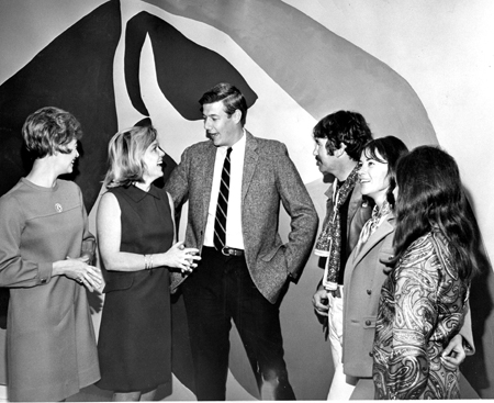
Like Piet Mondrian, Stuart Davis and Jackson Pollock, Parker was a fan of jazz music; and his interest in Jazz, combined with his interest in abstract expressionism, led to his improvised painting style. Parker was also a great admirer of the painter Henri Matisse and he looked to this artist’s work for inspiration in terms of color and form, especially in his paintings of the 1970s and 1980s. By the late 1950s, he taught at Hunter College in New York City and he developed a singular style of painting that focused on intense color and simple geometric shapes. He was represented by the Samuel M. Kootz Gallery, one of the leading contemporary galleries in New York City during the late 1950s through the mid-1960s. At that time the Kootz Gallery represented important living artists such as Pablo Picasso, Pierre Soulages,Hans Hofmann, Zao Wou Ki as well as Ray Parker.
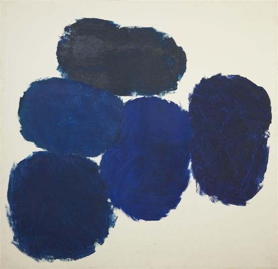
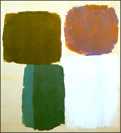
He is best known by his work of the late 1950s early 1960s called his Simple Paintings. These paintings are characterized by discreet cloudlike forms of clear, and intense color set against a white or an off-white background. Parker’s paintings utilizing this method of stacked, clearly colored lozenges and floating forms are straightforward and basically geometric in shape. Ray Parker’s works relate to and predict the minimalist and Color Field paintings of the 1960s, made popular by American artists such as Morris Louis, Friedel Dzubas, Jules Olitski, Kenneth Noland, Helen Frankenthaler, and Ellsworth Kelly.
~
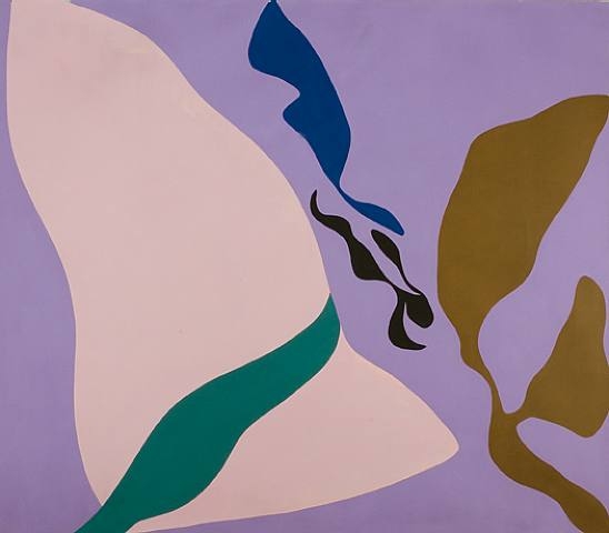
I loved all of Parker’s artwork above, but decided to use his color field paintings from a little later in his career as my primary source of inspiration for my piece. Here are some examples of those.
I love the shapes and colors that he used in these paintings. I was excited about what shapes and colors were to emerge
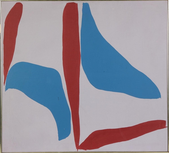
from the canvas of my art.
I also closed my eyes and stuck my hand into my oubliette of paint and pulled out tubes at random. Partially because it was fun
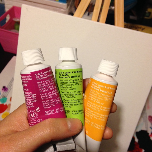
and partially because I didn’t want to sit there and overanalyze what colors to use.
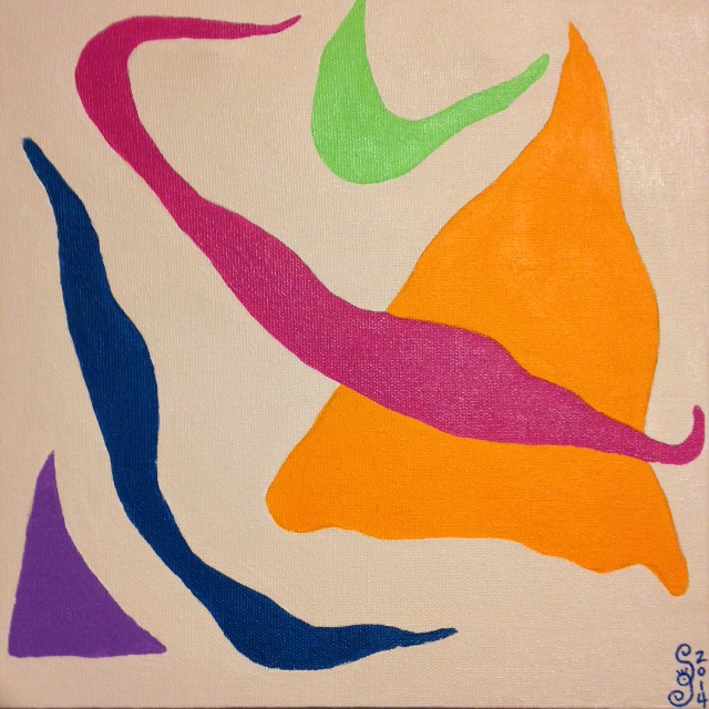
This painting was very relaxing to paint and I thought the random color choice turned out great! Despite my crazy day, painting this tribute to Mr. Raymond Parker allowed me to disengage and

slowly return to sanity. Thank you. Here is my piece.
See you tomorrow!

Acrylic on canvas
Acrylic on canvas

like that you chose ultra bright colors for your tribute, makes you think that he may have gone in this direction if he were painting today.
It’s funny because I chose the colors with my eyes closed! But I’m glad they worked out. Colors do seen brighter these days. 😉